Sunday, July 25, 2010

Black Flag (1986)

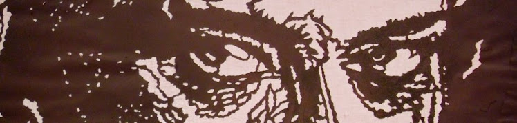
This is were the idea came from: a mate of mine had this brilliant tour poster of Black Flag in his room on which the four band members were drawn as creepy-looking comic figures, looking at you. This poster was so cool. I wanted this image on the back of my black leather jacket. But how should I do this?


This is what I did: I borrowed the poster, made a copy, took a pair of nail scissors and cut away all the white, which was comparatively easy because the image was b/w anyway.

The four figures were standing slightly apart. so I could seperate them, and work on them one by one. I think in the end I glued the four templates on the jacket. I then took some white spaypaint...

Actually, the picture looked absolutely BRILLIANT, and every bit as I had hoped it would. But there was something with the paint... it never really dried on the leather: So I had to be careful not to lean too long at any wall while wearing it, because it came off with a little slurping sound and left tiny white spots. I think after a month or two I gave up on wearing it. But the idea was there.


Henry Rollins and Black Flag. The actual tour poster is nowhere to be found.

Druuna (1987)

In the following year, I came across a godawful Italian comic, but one image stayed in my head. This picture was far more detailed then the Black Flag poster, so there was no way I could use paper and scissors. Sticking to the same general concept, I used thin cardboard on which I glued a strongly enlarged copy of the original picture. The original was approx, 3 x 5 cm. The template was 50 x 70 cm. As far as I can remember, I worked about 2 months on it with stencil knives, mostly in the evenings. I went through 2 - 3 blades per evening, and I had to wear tape around my fingers. It was rather painful. But I still have the template, 22 years later, so the general idea must have been right.


The problem here was: how could I make the template adhere tightly enough to the undergroud so the picture would not come out all blurry, but with these razor-sharp borders between colour and no-colour that I had liked so much about the Black Flag picture? Glue would mean the loss of the template after the first attempt, and just laying it on the canvas (cardboard, actually), produced poor results. The solution was, quite simply, to use needles. I pinned the picture with about 50 needles to the cardboard, and the resulting picture knocked me clean off my feet. I just could not take my eyes off them, and I could not stop making more and more pictures. I have only two left now, gave away the others. Probably my friends thought, this boy must go out more often.

Druuna: Detail from the template


Druuna: Spraypaint / Black cardboard, 50 x 70 cm

Michael Ironside (1988)

This is the most obvious and well-known image I did. The image was so famous that the Green Party cited it in an election.You can watch Mr. Ironside making someone's head explode on Youtube to this date.The original I used was a very small picture from a newspaper. The distortions were massive. It came out well, all in all. I think what I don't like about it is that it is a famous image. I never tried that again.

Originally, I used needles to pin it to the underground, like the previous template. I made this particular picture later, after I had discovered Spray-Mount. Spray-Mount changed everything.


Michael Ironside: Detail from the template

Michael Ironside (50 x 70)

Diamanda Galas (1991)

"You must be certain"

The original line read: You must be certain of the devil. By simply applying my standard 1:14 frame that I needed to blow the image up to 70 x 100 cm, the last three words were cut off and gave the first four words a new meaning, especially when put in context with the Sicilian-looking woman that seems momentarily lost in her own thoughts while leaning against her hand, which holds a gun. Certain of what? I like this one to this date. While I write this, I look at it because it is the only one that hangs on the wall of my room.

Technically, I had to solve the problem of a part of the template that was not connected to the rest of the template (the eye). The solution was of course to keep the surrounding "white" face in one piece and cut out the eye also in one piece. Then I could use the face piece as a "negative" to position the eye correctly on the canvas before spraying. Worked perfectly.

It could not have worked so perfectly unless I hadn't discovered Spray-Mount around that time. It is (or was?) something that is used in architect's or cartographic offices to temporarily stick plans or maps together, and seperate them again.
I still have the template and the face negative, but I lost the eye. Argh!

Diamanda Galas: 70 x 100

Elektra (1991)

"She's out in the open. Were they can see her."

Absolutly. Another comic. The whole image was simple enough, but this time the idea was to get three colours done. So I needed three templates, and I had to think the whole thing through to keep the necessary positive/negative bits of the various templates to be able to shade the different layers when I needed to. I was very pleased with myself at the time and I still think the image has a great expression, but I was also beginning to feel that the whole idea of recreating a small image as perfectly as possible in a larger size was getting boring. Yes, I had proven the point, but nothing else. I started to try things out, like "injuring" the perfect surface directly after spraying, or spraying dots and shadows around the image. I could feel that there was more to this, but I did not know yet how to get to it.

Elektra: Template (one of three)

Elektra: 70 x 100 cm
This work was where I discoved modelmaking paint. There was this little shop which was frequented mostly by middleaged men who had nothing better to do with their spare time then to build little models of WWII  tanks and planes, and me, who only bought the little spray paint cans. Hmmmm.

I knew that I had found something good when I saw the contrasts between the red and black parts of the image. Somehow the borders played tricks on the eye. The colour was thick and heavy (and expensive) and had a crazy, intense quality to it. The only other colour that came close to it was hull paint. O boy. You could almost feel the heavy metal particles settle in your lungs while using it.

Kyra Schon (1991)

This is a very hungry kid. And her parents are stuck with her in the cellar.

Everyone kept saying, aha, you did Jim Morrison, which irritated me considerably.

In this one, I tried a number of things for the first time: highlighting areas (the eye), different colours (the mouth) and double exposure. Especially double exposure lead to results that I found very satisfying at the time. I used the idea, together with other stuff, a great deal in later works.


Kyra Schon: Template


Kyra Schon: 70 x 100

Kyra Schon: Double exposure


Untitled (1991)

This was the last time I did a comic. I tried to push this as far as I could, and be done with it. Today I think I had to get this one out of my system to be able to try out other things.
I filled the space of 70 x 100 cm with as much detail as possible, maybe to test if there would be any limit to this technique, any detail I could not cut out of the cardbord with my stencil knife.

As a piece of craftmansship I can still appreciate it, but as an image it doesn't do anything for me, and somehow I think, it never has. And the reason for it is that there is TOO MUCH detail in it, there is no room for ambiguity and interpretation.

Untitled work: Template


Untitled work: 70 x 100 cm image